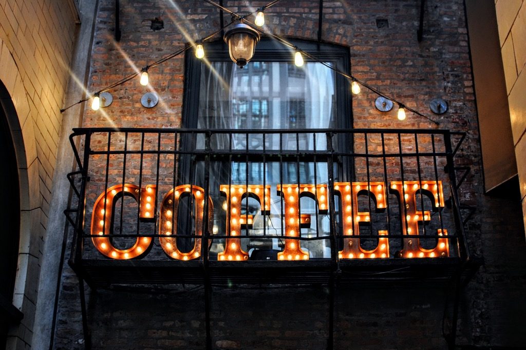
3D and illuminated storefront signs are the perfect outdoor signage for a business, especially retail stores, food stores and even restaurants. When done correctly, 3D and illuminated storefront signs are eye-catching, look professional and give new customers a great first impression of your business.
When thinking about what should be on your 3D or illuminated storefront sign, you want to make sure you’ve got the right kind of space to make it stand out and be seen. The next step (of course) is making sure you’ve got a great logo or brand name to boast about. If you haven’t invested in professional logo design, it might be a good idea to do so – as well designed logos look even more amazing as 3D and illuminated storefront signs.
When your shopfront sign is illuminated it can give a nostalgic feel to the store (reminiscent of retro lighting) if you go for that effect. This can be great for certain kinds of retails brands who want to stand out for being quirky and different. Another style of illuminated lighting might make your signage easier to see, or even give it a more modern effect.
For 3D signage, it literally makes your brand stand out. 3D signs stand up from their surface, so they’re immediately easier to read and remember.
Here are some examples we’ve come across, that we think work really well:
Apple’s glowing Apple – NYC
This storefront is iconic, so we had to include it. The glowing logo in the heart of the glass square is eye-catching, original and completely unique. There’s no storefront quite like this and it’s amazing how memorable it is. Whilst it may not be possible to recreate something this big on a normal budget – the idea of suspending the illuminated sign is definitely one to think about more.
Katz Deli – NYC
The reason we love this storefront is because it’s classic and retro and the design totally fits with the product. The deli is one of the oldest in New York, and the retro signs and styling outside completely back it up and give people the nostalgic, historic experience they’re expecting.
Dior – Paris
The Dior storefront is Paris is a classic timeless example of 3D lettering and signage. It’s simple, subtle and it speaks volumes about the luxury of the brand. Nothing fancy needed here – the logo and brand name speaks for itself.

